
Goodo
An app that empowers people to explore, donate to, and follow the impact of charity projects through personal stories and clear progress updates
✦ Challenge
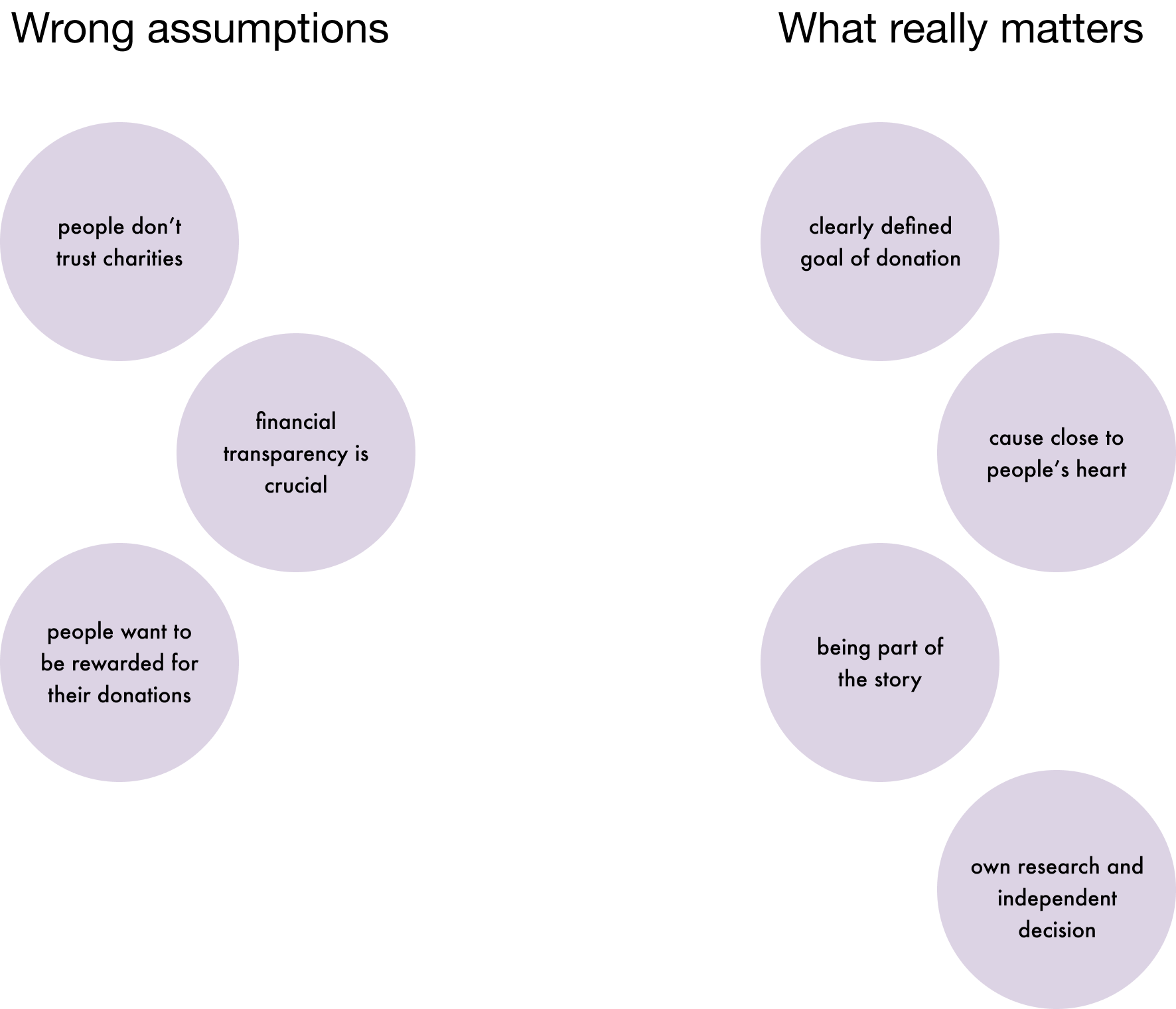
Younger people often hesitate to donate—not because they distrust charities, but because they’re unsure how their money is used. Traditional donation platforms focus on abstract financial data, but donors crave real stories, clear goals, and a sense of personal connection.
Through desk research, a survey, and five in-depth interviews with both regular and hesitant donors, I uncovered some key patterns: people feel more engaged when they can follow a cause over time, not just send money into a void. They prefer donation experiences that resemble crowdfunding, with clear goals and progress updates. And while most charities focus on trust through transparency reports, most users don’t want numbers—they want narratives.
Most importantly, donors want to give from a place of curiosity and care, not guilt. Pushy tactics like street fundraising often backfire.
✦ Approach
The research helped me reframe the problem: not how to persuade people to donate, but how to create space for meaningful, self-directed giving.
I defined a primary persona: a busy, values-driven person who wants to help, but needs to feel their donation makes a real difference. Based on this, I formulated a set of “How might we” questions around transparency, discovery, and emotional connection.
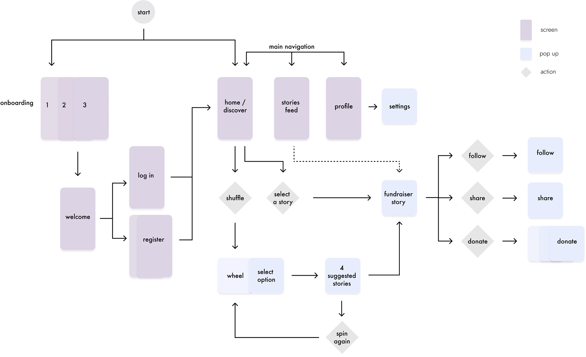
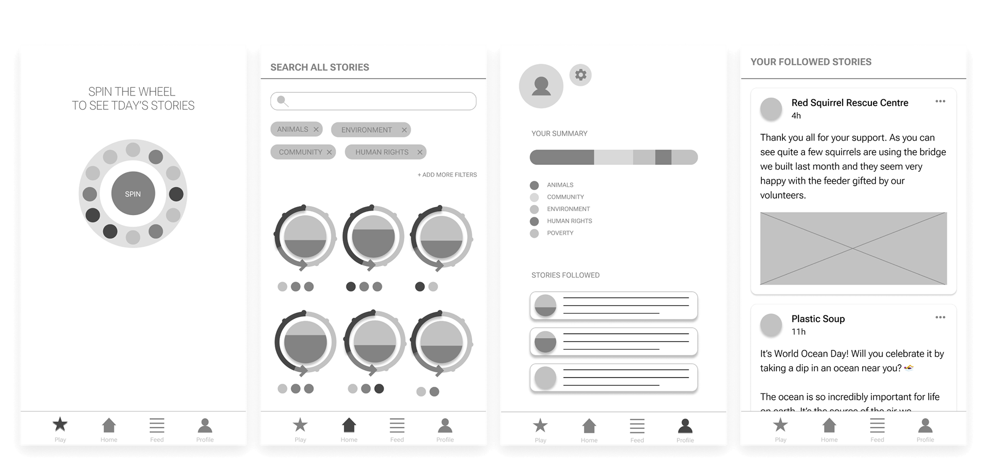
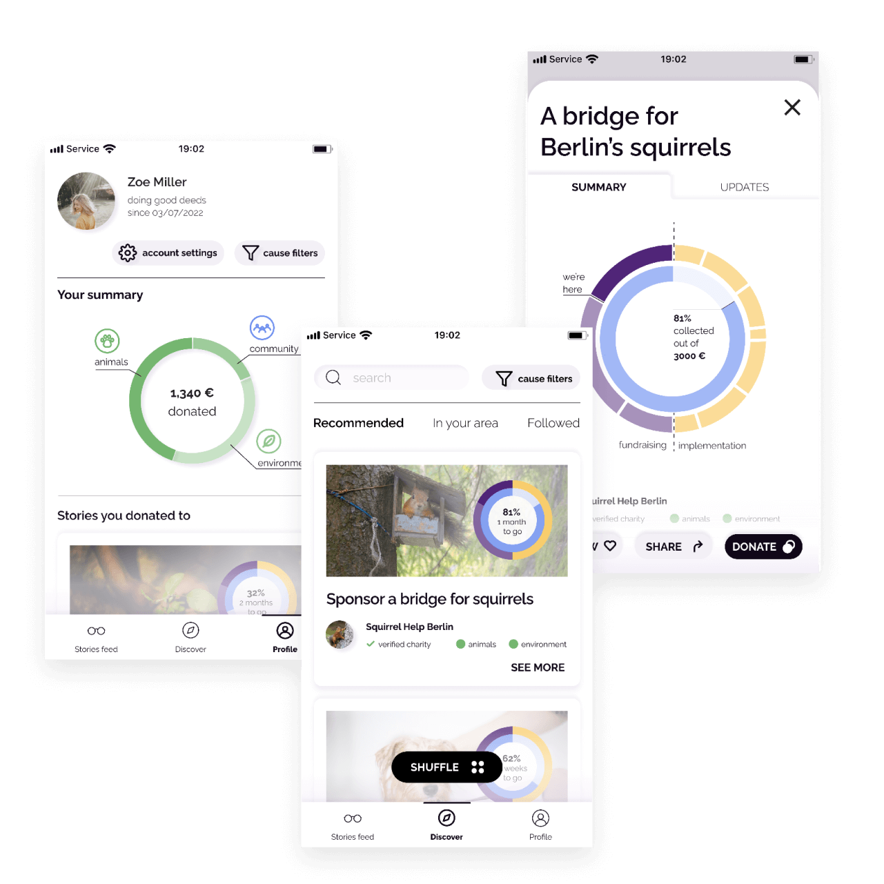
Design iterations focused on turning donation into a storytelling experience. I explored different ways to present causes, show progress, and make exploration feel playful rather than pressured.
Core features included:
- Story Feed that lets users browse causes through narratives, not statistics
- Time Wheel visualising the full journey of a donation—from fundraising to implementation
- Profile section with past donations and updates
- Shuffle feature that playfully suggests new causes to explore
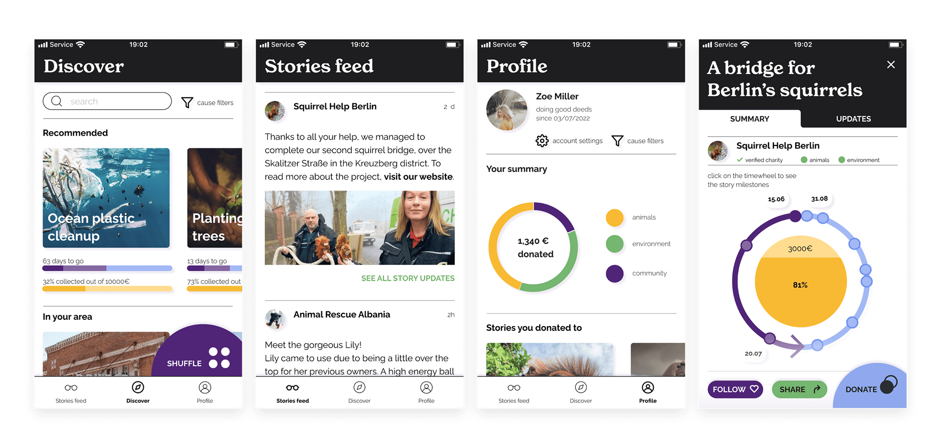
Through usability testing, I found that users appreciated the engaging tone and clear flows. The shuffle feature made discovery feel spontaneous. The Time Wheel helped communicate progress but needed visual simplification. I also revised the color palette to improve readability and trust—moving away from bold experimental colors toward a calmer, more familiar UI.

✦ Outcome
The final result was a high-fidelity mobile app prototype that made giving feel transparent, interactive, and personally meaningful. Users felt more confident donating when they could see where their money was going, follow stories over time, and choose causes freely—without pressure or guilt.
This project taught me that good design isn’t just about functionality—it’s about creating emotional clarity. Trust, engagement, and personal agency turned out to be the real currencies of meaningful giving.
✦ Methods & Deliverables
Methods: Desk research, user interviews, personas, journey mapping, wireframing, usability testing
Deliverables: Mobile app prototype (low- and high-fidelity), click-through prototype, user flows, storyboards
see mobile app click prototype →
Deliverables: Mobile app prototype (low- and high-fidelity), click-through prototype, user flows, storyboards
see mobile app click prototype →